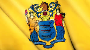
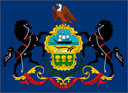
Is anyone else upset that New Jersey’s state flag has such a poor design? And let’s not stop with the Graden State: nearly every US state flag is brutally bad and, in most instances, nearly impossible to distinguish. Case in point: whose flag is this?
My buddy Nick is a transplant living in Colorado. Upon visiting back East, seemingly every article of clothing he wore was emblazoned with some iteration of the Colorado state flag. Similarly, every music festival from LA to Ibiza features the Californian bear, Union Jack, every Nordic Cross, and one of the wold cards: Ivory Coast / Ireland, Monaco / Indonesia, or Texas / Chile. As someone who unabashedly loves his home state, I seethe in rage knowing I can’t represent New Jersey in the same manner.
A flag isn’t just some frilly fabric with pretty colors on it. A flag embodies an ethos; it represents a people. Say what you will about the tenants of National Socialism, Dude, but don’t tell me they didn’t understand branding! (As an aside, we really need to take back red / black flags from non-freedom lovers.)
The North American Vexillology Association (NAVA) stresses five basic principles of flag design. Let’s break them down as they relate to NJ and the Union as a whole:
1. Keep it simple. A child should be able to draw it from memory.
(Hodgepodges aplenty! NJ’s heraldry alone has 8 components. We need more Game of Thrones sigils – and fewer coats of arms.)
2. Use meaningful symbolism.
(Most every state flag takes this too literally and uses detailed illustrations of horses, humans, etc.)
3. Use 2-3 basic colors.
(Over 2/3 of the 50 use more than 3 colors.)
4. No lettering or seals.
(Oops. 27 include the state seal. 12 outright state the name.)
5. Be distinctive or be related.
(Treat the states as subnations and use imagery found on Old Glory: stars and bars. New Jersey’s most distinctive feature is that it’s yellow.)
If only our state banners bore a bit more design sensibility…
~ Chase Cambria, Jr. Copywriter, The S3 Agency