A late but strong contender for Design of The Year, Ticket Books by L&PM Pocket and São Paulo-based Agência Africa are the perfect blend of polish and practicality. Encouraging reading by turning these books into scannable transit passes is pretty brilliant. Take a look at the video:
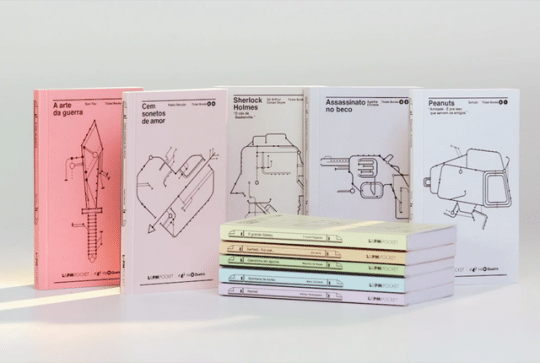
As one who keeps the furnace lit through adverbs and alliteration, encouraging the public to sit down and read will always garner my applause. Brazil’s most popular pocket publisher has cleverly implemented RFID chips into the back covers of literary classics, which stores credits for 10 trips on São Paulo subways.
A noble cause, of course, but the terminal-inspired cover art is what makes this project shine. Wonderful as the illustrations are, do we have to dock points from Originality? Off the top of my head, Animals on the Underground, the 2015 NBA All Star Game, and 1,288 results on Etsy for “Subway Map,” all utilizing “railsketch” show this style is currently hip. Paired with the universal font for all things mass transit, Helvetica, and there’s definitely a sameness that associates these projects. But the question I pose to you, dear reader, is do we care? Akin to playing the same song over and over and over again until you’re bored of it, railsketch will likely follow a similar trajectory for me, as the general concept is still lovely. It’s not the most innovative project we’ve covered this year, yet it may still prove to be my favorite.