Let’s establish a truth: I am no firearms aficionado. I only know the difference between a clip and a magazine when within finger’s reach of Google, and I don’t have a strong enough opinion of the 2nd Amendment to plaster it on my Buick Regal. This is not morally- or ethically-driven, I simply love branding. Glad that’s out of the way.
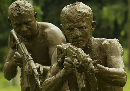
The AK-47 is a polarizing icon. In terms of global political importance, it could possibly be mentioned in the same breath as Mahatma Gandhi and Nelson Mandela. The Avtomat Kalashnikova, model year 1947 (AK, Kalash) is the trusted rifle of ethnic skirmishes and guerrilla uprisings the world over. As Nic Cage points out in Lord of War: the Soviets put it on a coin, Mozambique put it on their flag. It doesn’t jam, it won’t overheat. It’s affordable on even the most frugal warlord’s budget. It can sit buried in the Saharan sand for a decade and still fire with the same efficiency as when it left the line in Leningrad. And yet it is a sinister reminder of the evil that lies within man; a mercilessly effective weapon, capable of mass eradication with the flex of a forefinger. It, quite simply, is a marvel of manufacturing.
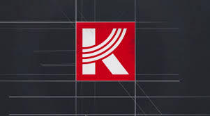
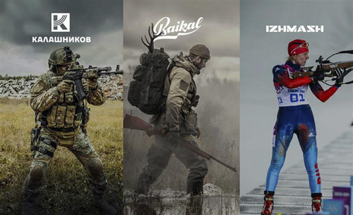
Despite its standing as the world’s most recognized rifle, neither the AK or its manufacturer Kalashnikov Concern (Formerly Izhmash) has established this without the use of any identifying signatures beyond what would be found on an order sheet. Kalashnikov Concern has rolled out 4 new, separate logos for the following: The overarching Kalashnikov Concern company; Baikal, which produces rifles and equipment; Izhmash (Why they opted to reuse this name I’ll never know), which makes sporting weaponry; Kalashnikov, which deals in military-grade weaponry. While Baikal and Izhmash (Seriously, WHY include your previous brand name in a rebrand?) feature some lovely wordmarks, we’re solely focused on Kalashnikov.
The logo is brilliant. So simple a young soldier could draw it. The iconic curved magazine that makes up the “K” monogram is distinctly Kalash. The simple one color + white palate makes for easy recognition and printability. Also, that color, that kill-you-dead red, surely tested well with disenfranchised males aged 6-24. This is a branding triumph for a product that didn’t even need it. We’ll gauge its success by whether or not the M16 rolls out an identity package in the coming years.
~ Chase Cambria, Jr. Copywriter, The S3 Agency

Editor’s Note: While we at The S3 Agency are all about branding, we reiterate what the writer of this post said: we are not about guns or violence in any way, and we do not endorse these products.