Grocery stores are the bastion of branding. For those of us who get a rise out of quality kerning and lovely packaging, few experiences compare to perusing the aisles while being bombarded with branding. But we are not most people. The lot just want the best, or the cheapest, or – more likely than not – whatever catches their eye first. Product “samespeak” serves to scare off many an unsuspecting customer. All four of those turkey jerky brands claim to be “America’s #1 Decision You’ll Regret at 2AM,” so who am I to believe?
Enter design. When is less more? Often, on the package packaging. When vying for eyeball views on scarce and ultra-competitive shelf space, clutter is an instant turn-off. Most brands are still deathly afraid of being understated, as if they’ve forgotten everything they know about courtship. Confidence is quiet, insecurities are loud. Who cares if you were established in 1861 if your last loyal customer died in a Prohibition raid? Fat, GMO, gluten (and flavor) free? Lose the clip-art text bubble, four-point copy may suffice nicely.
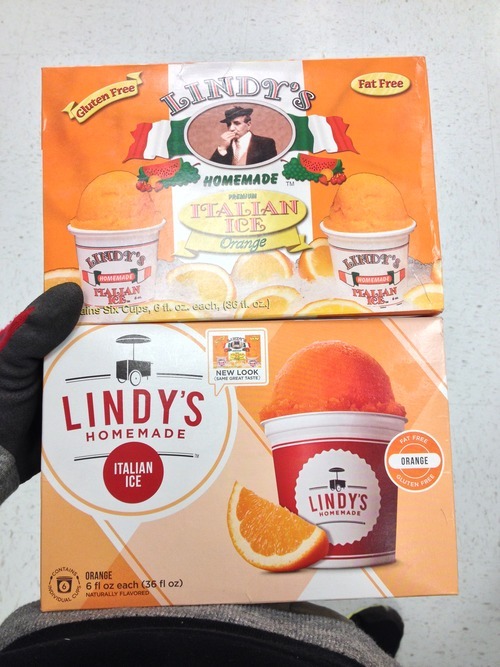
Luckily, some of the competitors are getting the memo. Scope Lindy’s. Who the hell are Lindy’s? Well, they’re not Rita’s and they’re not Luigi’s and they’re not on the first page of Google’s results for “Italian ice,” so you get where I’m going. They’re scraping by. The surely lovely Lindy’s family hasn’t eaten anything but shaved ice since Sputnik went up. I am SO relieved that someone had the sense of mind to say, “Ya know, our brand sucks.” Why is that so difficult for most me-too brands to grasp?! Blow it up! Start again! Bless his soul, but axe Lindy, he looks like he’s about to order a hit on rival Don “Sweets” Caprigliazo. Hey is this orange-flavored? We only have ELEVEN references to them on the box.
The new handcart moniker is brilliant, an instant call back to World’s Fairs of yesteryear when Italian ice dominated the confectionary scene. The argyle pattern just works, and it’s wildly different from Rita’s barberpole sequence and Luigi’s excessive use of gradients. Notice the individual cups icon in the bottom left corner. Those spoons! The previous packaging was using drop shadows in their place! This is the work of some seriously talented designers (who I’d love to give credit to if Lindy’s website wasn’t still stuck in 1996 at the time of writing, but I imagine that’s next). My only gripe is opting to use the “new look” call out and still giving that abomination of a box any face time, but that’ll surely subside soon enough and it’s such a massive upgrade, I’d be remiss to nit-pick. I wouldn’t have batted an eye at an old pack of Lindy’s even with a tommy gun stuck in my gills, but I won’t think twice about who to go with in the future. Do less on the box, brands, you’ll do more for your bottom line.
~ Chase Cambria, Jr. Copywriter, The S3 Agency


