In love. Adorable. Too cute.
These may sound like the Twitter ramblings of a 14-year old girl after stumbling across a baby otter photo stream, but they’re actually my fond feelings towards Southwest Airlines’ updated branding efforts.
I never glommed on to the fact that their previous offerings were just…an airplane with a wordmark. Humorously dated and damn-near offensive for the 2010s. Logos these days need to be recognizable at any scale and scalable to fit any space. This is not earthshattering analysis in an age of vector-based imagery, yet brand-driven corporations still regularly fluff it up. Their compromise is the Heart, a cutesy-wutesy emblem that packs a roundhouse kick’s worth of design equity and personality.
Southwest is not only the sole aviator using a heart-shaped icon, it’s also the only airline that can use it with meaning. Southwest’s zealots rival Apple’s fanboys in terms of fanatical brand loyalty. Who needs single-serving peanuts, legroom, or even a functioning seatbelt? We’re flying to Ft. Lauderdale for less than a tank of premium in my Land Rover! Amenities be damned!
Equally if not more important than the logo itself is its application. Never an afterthought but always understated, the Heart never SCREAMS its presence, it merely serves as makeshift punctuation. In a world where the top client demand is, “Make the logo bigger,” it’s refreshing to chalk up a win for the design team. And, when applicable, they DO blow the logo up (Vectors!) to make use of the Heart’s stripe pattern, which adds consistency to the identity package.

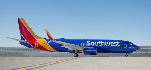
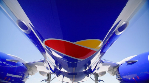
Just look at that livery. Let it saturate you. That’s a Boeing turbine price tag in paint alone. They’ve swapped their traditional red-throated robin undercarriage for the Heart, yet their recognition from the ants on the ground won’t skip a beat.
I think I’m so attracted to this new look because of how unabashedly confident Southwest is in their execution. Imagine another recently updated aviation brand, American, adopting a heart instead of that faux-eagle-thing they went with. Paired with a dingy slate grey livery and opting to use the world’s most popular typeface, they’d be eviscerated for “trying too hard to connect to the consumer.” But not Southwest, they’ve built that friendly rapport with their coupon-clipping clientele and are completely unapologetic.

The first time I scope out a 747 with the Heart emblazoned on its underbelly, I’ll likely think, “I wish I loved anything as much as those acolytes love flying Southwest.”
~ Chase Cambria, Jr. Copywriter, The S3 Agency


