Mobile technology keeps getting better. The average smart phone today has more computing and processing power then a desktop did 10 years ago. Because of this, people are using their mobile devices increasingly for everyday tasks. Currently, 28% of a typical website’s traffic comes from a mobile device (tablet and phone combined)*, and that number will only go up in the future.
With all these mobile users looking at your website, perhaps it’s time you took a look too – to make sure it’s truly responsive. Does the content automatically reflow to fit a particular screen size well? If not, that lack of responsiveness can be hurting your brand’s digital experience just as an unresponsive company representative can negatively effect the customer experience.
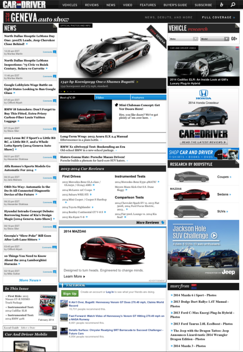
Take CarAndDriver.com for example. Visit the site via your phone, and you will see the standard website, with microscopic body copy and tiny images. Sure, you could zoom in, but then you’re missing all the content on the right side – including the advertisements for which brand are paying but whose impact is clearly minimized. This digital experience simply doesn’t do the renowned automotive magazine justice.

Compare that to Jalopnik, a popular automotive blog who has a much more modern online appeal and sensibility. Right away, you’re met with bold headlines and easy to read copy. Simply scroll down for additional stories – today’s mobile surfer has no issue with scrolling down, after all. Before you know it, your 15 clicks into the site. It encourages you to read, rather then making you work.

Car and Driver has been around for over 50 years, while Jalopnik is just a few years old, which has allowed the latter to respond (no pun intended) to technological needs much faster. As magazine subscriptions continue to decline, I suspect sites like Jalopnik will only continue to become more relevant.
* https://bgr.com/2013/11/08/mobile-devices-internet-traffic-q3-2013/
~ Mike D’Ambrosio, Interactive Art Director, The S3 Agency


