Not often enough do we praise others – people or brands – for just getting it right. So here’s a post about how Seaworth Coffee Co. swam straight into my heart at the grocery store.
This morning while perusing the aisles for some kind of healthy juice, I stumbled upon a shelf of cold-brew coffee. I have only recently started drinking coffee – and on this chilly 30-degree day, I wasn’t really interested in an ice cold coffee. However, I immediately fell in love with the packaging of these coffee concoctions. So I decided to do some research on Seaworth Coffee Co. and was really impressed!
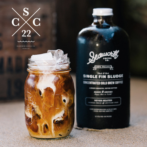
With a name like Single Fin Sludge, you know this is an organic coffee. Yay for quality! I’m already a fan. The packaging design is simple and compelling: the name and “#1 Best Tasting” claim are silk screen printed on a rustic, apothecary-esque looking bottle. The brand’s website has a minimalistic vibe that screams quality over anything else. I hate when brands overdo it by hitting you over the head with their branding, Seaworth Coffee Co. is subtle yet memorable. While on their homepage, a video starts playing with the sights and sounds of California, which is where this cold-brew coffee company calls home.
Does this make me want to buy their coffee? Absolutely. This brand makes me want to quit my job, buy a surfboard, and roast in the California sun with my cold-brew coffee. Kudos, Seaworth Coffee Co., here’s to hoping you deliver on your brand promise and taste as good as you look.
~ Samantha Banner, Jr. Copywriter, The S3 Agency