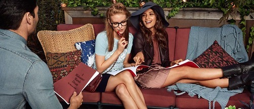
So, it seems the world hates Marsala, the Pantone-declared Color of 2015. Multiple media outlets (including this blog) have reported the color as “icky,” “gag-inducing,” and “dull.” Apparently childhood memories of rusty metal surfaces and grimy college dorm rooms abound…who knew?
But here’s the thing: more goes into choosing a Color of the Year that just picking a pretty hue out of a fan book. Last year’s color (Wild Orchid, for those of you not keeping track) worked for little more than a teenage girl’s iPhone case or the paint in a tiny half bathroom. It just wasn’t a friendly color for most applications – it was far from unisex, a large flood of it was practically nauseating and in terms of textiles the color was only flattering on about 10% of the population. I, personally, couldn’t even pull off a Wild Orchid pedicure.
Marsala, on the other hand, is far more versatile. It lends itself to lipstick as easily as it does to the leather seats in an Audi R8. It’s a forgiving color for most skin tones and is simply classic – it has infinitely more longevity than its predecessor. I find the most problematic issue with the color to be its name – perhaps it’s my east-coast heritage, but all I can think of is chicken and veal. I have a hard time believing that the Pantone folks couldn’t come up with anything else, even a more palatable choice of wine. But despite the moniker, Pantone, fear not – I back your choice. I will just be referring to it by it’s true name: 18-1438.
~ Trish Salge, Sr. Art Director and Chief Color Correspondent, The S3 Agency


