Many brands wish to appeal to the “ironic crowd” – hipster influencers who determine what is cool – and MINI is no exception. Over the years, we’ve enjoyed the small car’s big appeal via out-of-the-box creativity that didn’t try to hard. Achieving that perfect balance drew in throngs of admirers (and buyers), leaders and followers from many walks (or drives) of life. That’s why I was so surprised to open my NYT Men’s Style Magazine this weekend and see this ad from MINI gracing its pages:
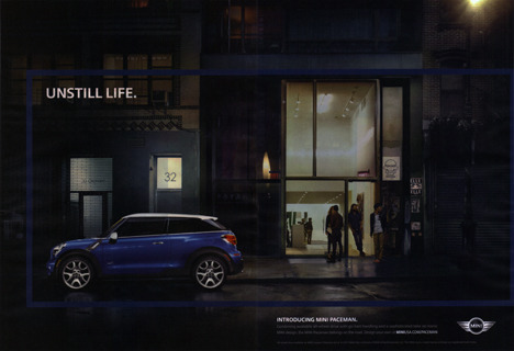
The headline “unstill life,” clearly meant to be a play on words (as in the opposite of a still life painting) falls woefully, um, still. As the MINI Paceman sits still, parked outside a building on a street with no pedestrian or vehicle traffic, our eyes are drawn to the inside of the building where we see people. People doing nothing interesting. People standing pretty darn still. Even the traditionally bright band of color that usually borders MINI ads is reduced to a barely visible dark, somber blue. This photographic portrait is a still life any way you look at it.
And therein lies the irony…not the kind this iconic brand was going for, I’m guessing. But heck – everyone’s allowed a misfire once in a while.
~ @AdvertGirl