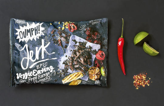
We consider ourselves the authority on Swedish soy-based product packaging because, well, why not. Installment #1 of a planned 342 takes a look at OUMPH! That was fun to type, and its even more fun to say aloud in succession and pretend you have Coachella tickets.
Standalone, I’m not in love with the logo. The wordmark feels slightly unbalanced, especially between the first two letters, and could stand to embolden the “O.” Similarly, the “U” and “P” both feel too clean at a distance, and I’d like to see the bristle-edged motif play a more prominent role throughout. Calling it inconsistent would be a disservice to a great effort, but I’d say it has room to improve with a few minor tweaks.
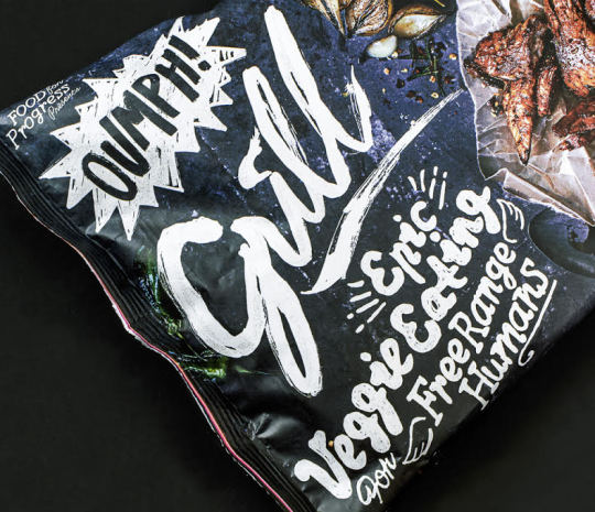
The packaging, however, is scrumptious. Laughing in the face of conventional wisdom and preconceived notions about ready-made meals, OUMPH!’s raw photo composition really blossoms against the black slate. With such a booming personality, I feel like I know OUMPH! better than most of my extended family. This isn’t your Kumbaya-singing tofurkey, OUMPH! has racked up noise complaints for blaring Sex Pistols during Sunday mass, and has spent a night or four in the San Bernardino P.D. drunk tank. Talk about contrast, too. It’s been many moons since stumbling down the aisles of a Stockholm supermarket prowling for a soy fix, but I can promise it’s full of safe, vibrant hues to assuage a passing shopper that, “I’m food! Really!” Each variety also boasts a slightly different placement for the logo, quick copy hit (Which is bloody brilliant to boot), and flavor name, giving the entire breadth an air of dissonance. It’s cool. It’s more than fun to say – you’d secretly love to slug shots and trade war stories.
I need OUMPH! on American shelves ASAP. Maybe they’ll let me ride on their motorcycle too…
~ Chase Cambria, Jr. Copywriter & Soy Snack Aficionado, The S3 Agency


