The Super Bowl: More than just a game and commercials
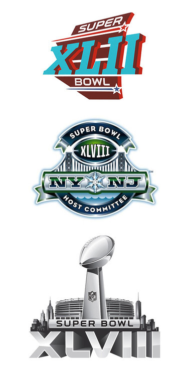
We’ve just witnessed the NFL’s 48th Super Bowl this year, which means 48 years of branding America’s biggest game. Even if you’re not a football fan, previous game logos were recognizable: colorful, bold, and usually represent something about where the game will be played. (For instance, Super Bowl 42, played in Arizona, featured a Southwestern themed logo, with teal and maroon coloring.)
Starting with Super Bowl 45, there has been a rebranding of sorts for the entire game. Now, each year the logo is the same; the silver Lombardi Trophy, emblazoned with the roman numeral below it and the host city stadium in the background. The result? Each one is now barely distinguishable. The roman numeral used to be a defining feature, but now XLVI and XLVII look nearly identical.
What makes it worse is the fact that the logo for this year’s Host Committee is very distinguishable, and could easily have been the logo for the game itself.
Each Super Bowl has 2 different teams with their own unique history. Even when the teams are the same (as in games 42 and 46), the circumstances are very different from each other, and the results are always memorable. I believe the NFL should emphasize that uniqueness and go back to those distinctive logos. Each team and fan remembers every game differently, so why shy away from that?
~ Mike D’Ambrosio, Web Designer & Logo Critic, The S3 Agency


