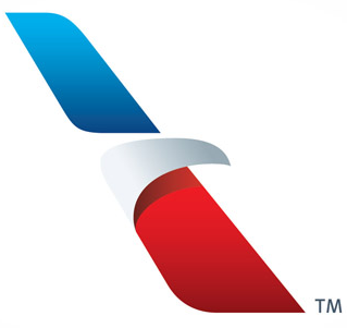
So last week American Airlines revealed a huge identity overhaul. Everything from the logo to the plane graphics. They have had one of the most iconic designs in the history of design, courtesy of Massimo Vignelli. This logo had been in place since 1968 and it still looks modern. Even American Apparel totally ripped it off with its simple Helvetica logo with no word spacing.
Here we can see the evolution up to 1968. A major improvement on all fronts. Let it be known that Massimo wanted no part of doing the eagle and actually refused to do it. Another agency had to illustrate it because of his refusal to compromise his design in his eyes. Needless to say, Massimo is not very thrilled with this new look.
Here it is, in all its glory:
While I do think it looks very modern, all I can see is a pair of 3D glasses. The eagle application is very cool and I love the use of negative space. This just doesn’t feel right to me though. It is too far removed from its evolution. I’m sure the brief had them throw out everything and start from scratch, as it seems they are doing that company wide in all facets. While aethestically pleasing, there is no doubt in my mind, this will not last 44 years. What do you think?
– Steve Juliano, ACD at The S3 Agency & OCD about planes


