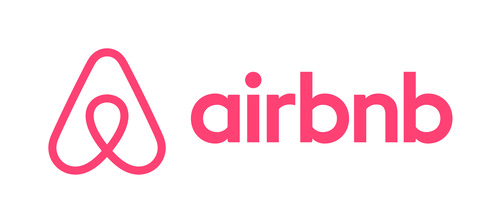
Last week Airbnb launched a rebranding campaign that included a website refresh and introduced a new logo which they called the Bêlo. They also released a new video explaining the new logo:
The new logo has all the elements of a well designed logo in today’s world: it’s memorable, simple, and looks like a part of the female anatomy…wait WHAT?!?!
 In case you haven’t heard, there has been quite a backlash about the new logo. There’s even a new Tumblr dedicated to alternatives for the logo (many of which are NSFW). The backlash also took to social media with many witty comments made on Twitter.
So how does this happen? How does a company miss what’s obvious to so many people? And more importantly, how can brands avoid having this happen to them?
Now some may argue that all the attention may not be a bad thing – after all, the company is now getting a lot of free publicity. I think it’s too early to tell if that’s true. Let’s not forget creative misfires of the past like PepsiCo’s disastrous Tropicana packaging change which was quickly reversed and cost the brand $33 million in two months.
I feel that bigger, more successful brands are more likely to have rebranding blunders because they have trouble envisioning failure. A long run of success may lead to egos that believe their company can recover from any misstep. Larger companies are also more likely to suffer from hierarchy issues: employees may defer to the opinion of the senior person in the room, despite the fact that a few junior people might think “that logo looks a lot like a …”.
Brand embarrassments as such can be avoided by doing a few things:
- Don’t overthink the logo – Assuming it will make or break your business may lead to the latter.
- Listen to junior marketers – They’re closest to their consumer instincts. Get their opinions first before senior leaders weigh in.
- Test it – Use a focus group, it’s easier than ever now. (Consider cost-effective online options.)
- Use common sense – There’s not enough of it out there. Try to avoid getting caught up in the symbolism as it can lead to self-delusion.
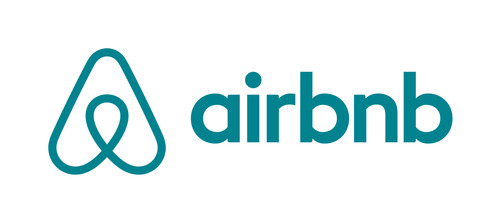
As for Airbnb, their heart was in the right place and I actually do like their new logo – just with a few alterations. It’s amazing what a change of color can do.
 ~ Walid Elshahed, Web Designer, The S3 Agency


