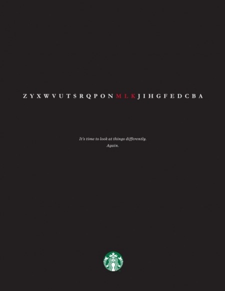
Starbucks nailed it with their tribute ad to Martin Luther King’s legacy that ran last Monday in The New York Times. Simple and clean, the ad features a line of letters with “MLK” in red with the copy line, “It’s time to look at things differently. Again.” At first glance, I was a bit confused, only seeing a single line of letters with MLK called out. Then I realized the line of letters are the alphabet displayed in reverse order. MLK naturally follow each other when read backward. This is pure brilliance because I actually had to look at things differently to see it.
This is a perfect example of a minimalist creative execution that is powerful and captivating and I love everything about it. In advertising, simple message has always been the strongest performer. That’s especially true today, in a world where we are barraged with a constant influx of content and distraction.
This ad gives me chills, which is probably exactly what Starbucks was hoping for. After all, their brand is about far more than a $4 (or more) cup of coffee.
~ Tracey Jeffas, Account Supervisor, The S3 Agency


