Or perhaps I should say: Creative, Creative, Creative. Because the location of all ads discussed in this post is not in question.
If you read The New York Times Magazine regularly, you may have noticed there are really just a few types of ads in this Sunday publication that reaches an incredibly desirable audience:
• Real Estate (residences for the wealthy)
• Expensive Furniture (for the residences of the wealthy)
• Investment Firms (for the wealthy and those who want to be)
• Hospitals (money can’t buy health)
Sure, there’s the occasional item that appeals to all (this week’s back cover features Microsoft’s new Surface tablet)…and my favorite regular advertiser, Big Ass Fans (which fits into the “Expensive Furniture” category and may find themselves the subject of another blog post). But I digress, for today I want to discuss the best and worst real estate ads from today’s issue.
Is real estate advertising inherently the most exciting of real estate categories? No. But I say that gives brands an opportunity to stand apart from the ho-hum efforts from their competition. First, here is an example of the ho-hummiest ad from today’s magazine:

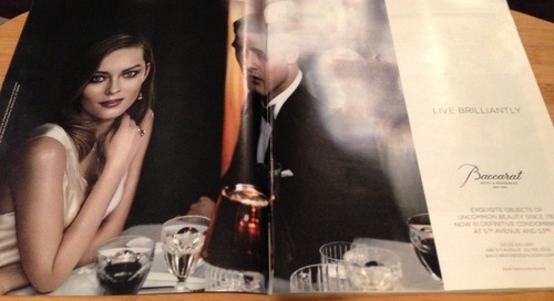
Come on, Baccarat! You can do better than that. While this photo of the actual magazine is taken with my decent-at-best iPhone camera, that’s not why the ad looks so bad – the imagery around the man’s head is actually all blown out in the real printed issue. The woman looks beautiful and makes me think this is an ad for crystal or jewelry – for which Baccarat is known, and for which the headline “Live Brilliantly” would work. Then, only because I am actually reviewing the issue for its advertising, I bother to notice the tiny “Hotel & Residences” nomenclature below the logo. Yes, somehow this photo of beautiful people eating dinner is supposed to make affluent Manhattanites plunk down however-many large on a Baccarat Residence. But why? Where is the differentiation? They are banking too much on a name well-known in other sectors and not providing enough to make one linger. Snore, and a stodgy one at that.
Now take a look at this ad for The Carlton House, which happens to appear on the page just before the Baccarat ad:

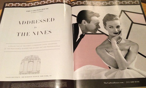
Well, now you’ve got my attention thanks to an eye-catching concept integrating a catchy headline and design that stands apart from its ad competition. “Addressed to the Nines.” Love it! Taking this superlative phrase and transferring it seamlessly to the real estate world immediately connotes that this is the place to live (for those who care about addresses, which is exactly whom both ads are targeting). The Hepburn-ish visual of a couple dressed to the nines indeed, but with playful posture and fun retro graphics around…well, this shows that the brand has personality and relevance for the modern upscale lifestyle. It makes me smile for many reasons, and that’s a feeling that should be associated with a residential purchase.
Nice job, Carlton House.
~ @AdvertGirl


