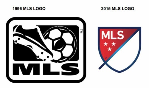
Major League Soccer has had the same logo since 1996. For the 2015 season, they’re rolling out a new one – a good move, since the original logo began looking a little dated back in 1997. It was a foot, kicking a ball. (Get it? It’s soccer! Oof.)
The new, minimalist shield design does a great job of bringing the look of the league into line with other great soccer leagues of the world. It is clean, modern and absolutely appropriate. It was also designed to be infinitely “recolorable” so it will look just right next to every MLS team logo on uniforms and signage. And significantly for today’s world, it is designed to be multi-platform friendly. There is plenty of space for animated graphics within the white field, and it fits in with a branding system that has been conceived to thrive on screens of all shapes and sizes.
You can read the story behind the logo’s development here:
Fans will tell you that MLS is gaining, inch-by-inch, on some of the world’s leading soccer leagues. The new logo reflects that growing confidence – and gives the brand something aspirational to shoot for.
~ Adam Schnitzler, CCO & Soccer Fan, The S3 Agency